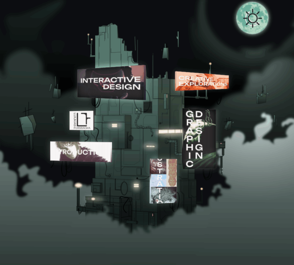
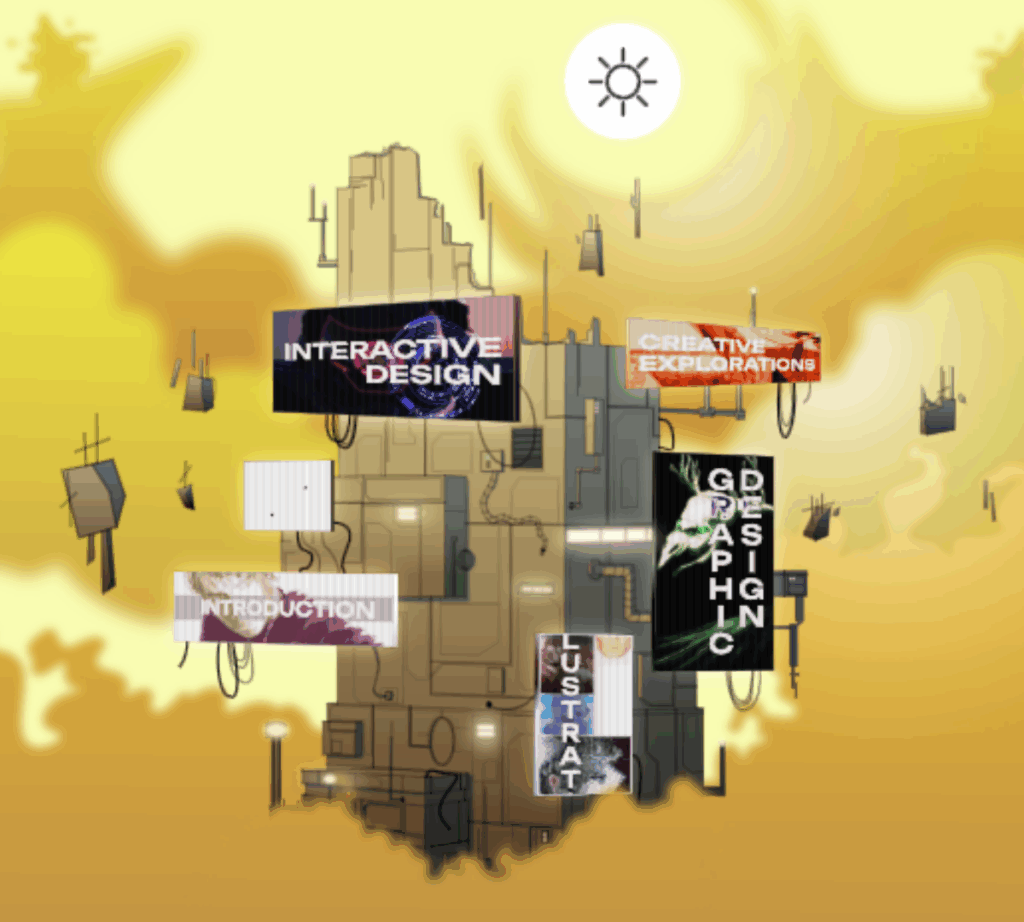
An experimental UI concept designed for my portfolio to explore the limits of functional UI design while maintaining an intuitive user experience.
This project gave me the opportunity to dive deeper into animation, UX, optimization and the basics of the actual implementation.
Adobe Illustrator, Rive, Clip Studio Paint
2025.
Process / Behind the Scenes
The core idea was to design a building-like structure where each screen functions as a link to a different part of my portfolio.
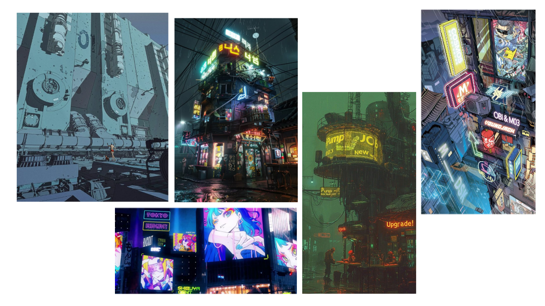
I began the process by building a moodboard to establish the overall aesthetic, color palette, and vibe. This became the visual foundation that guided the creation of the graphic.
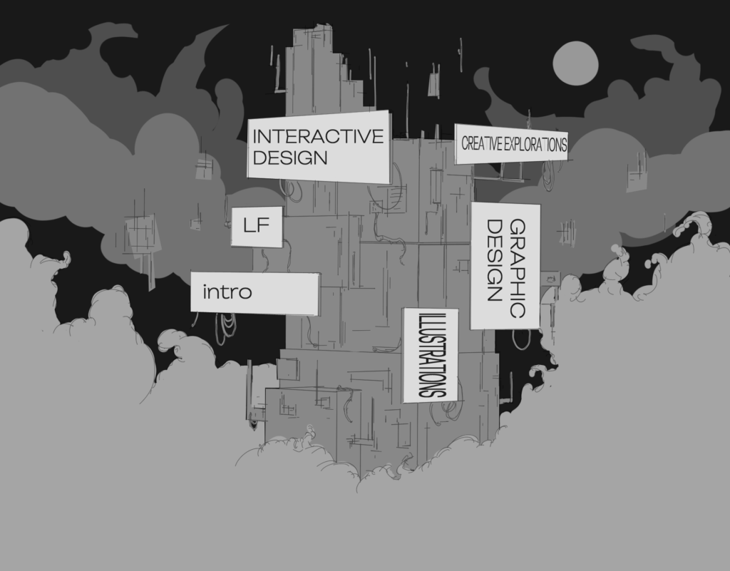
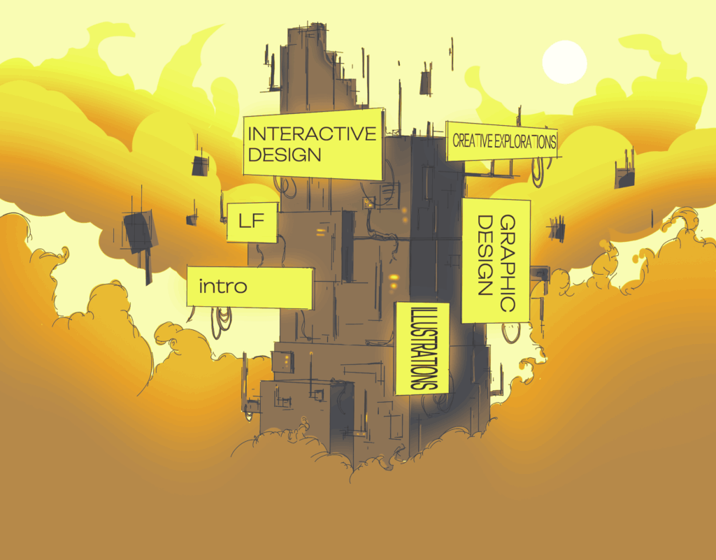
Initial thumbnail sketch of the main graphic, where I laid out the basic shapes, silhouettes, and value structure.
Considering the screen placements they had to be spaced far enough apart to prevent user missclicks, but still close enough to the center to ensure they remain visible when the window scales down, avoiding unwanted cropping.
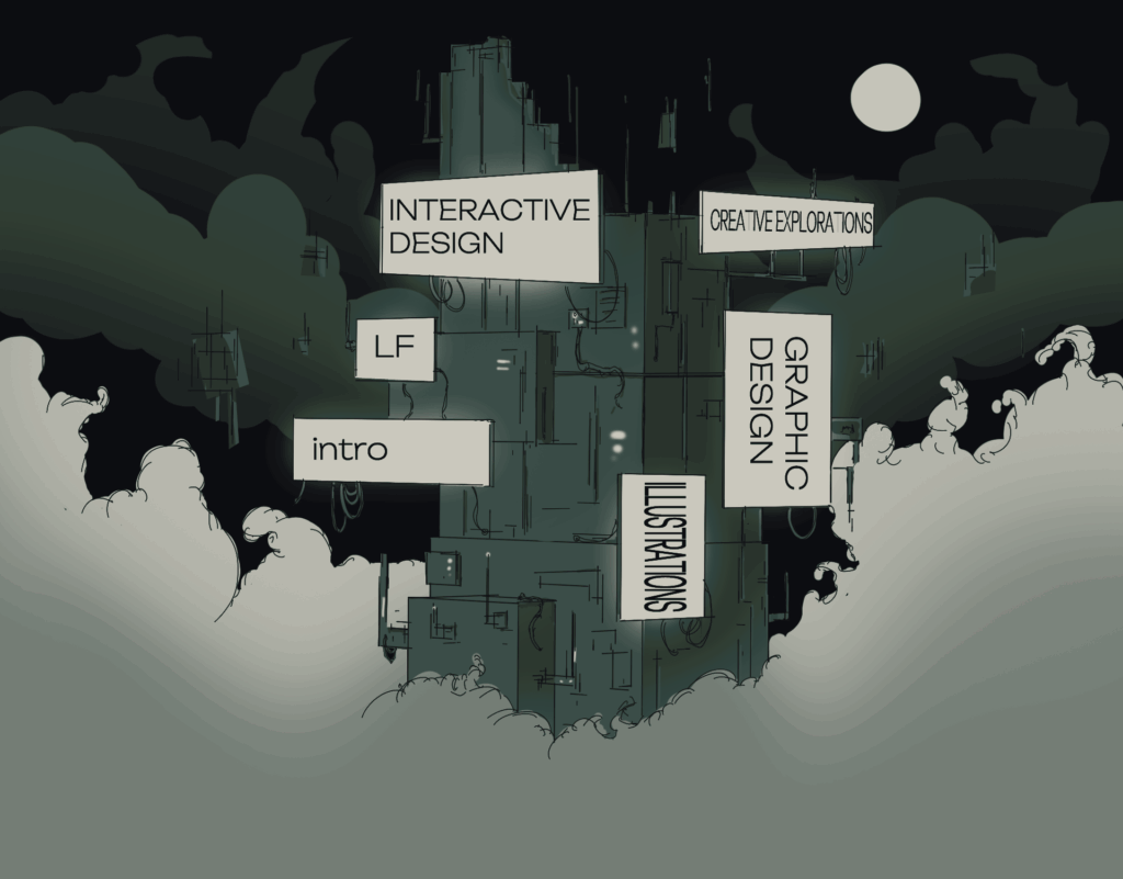
The next step was creating the color palette and gradient map to guide the lighting and atmosphere.
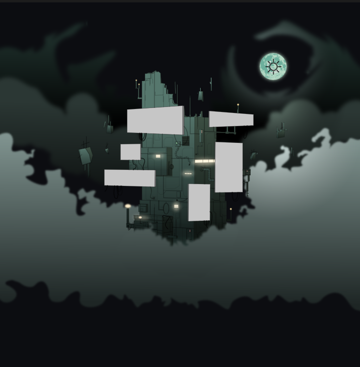
During this phase, I also came up with the idea to design an alternate light mode version of the interface, but still making sure the screen elements pop.
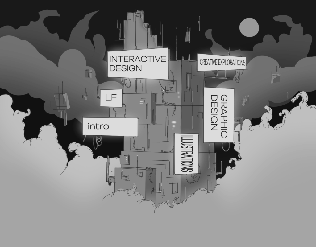
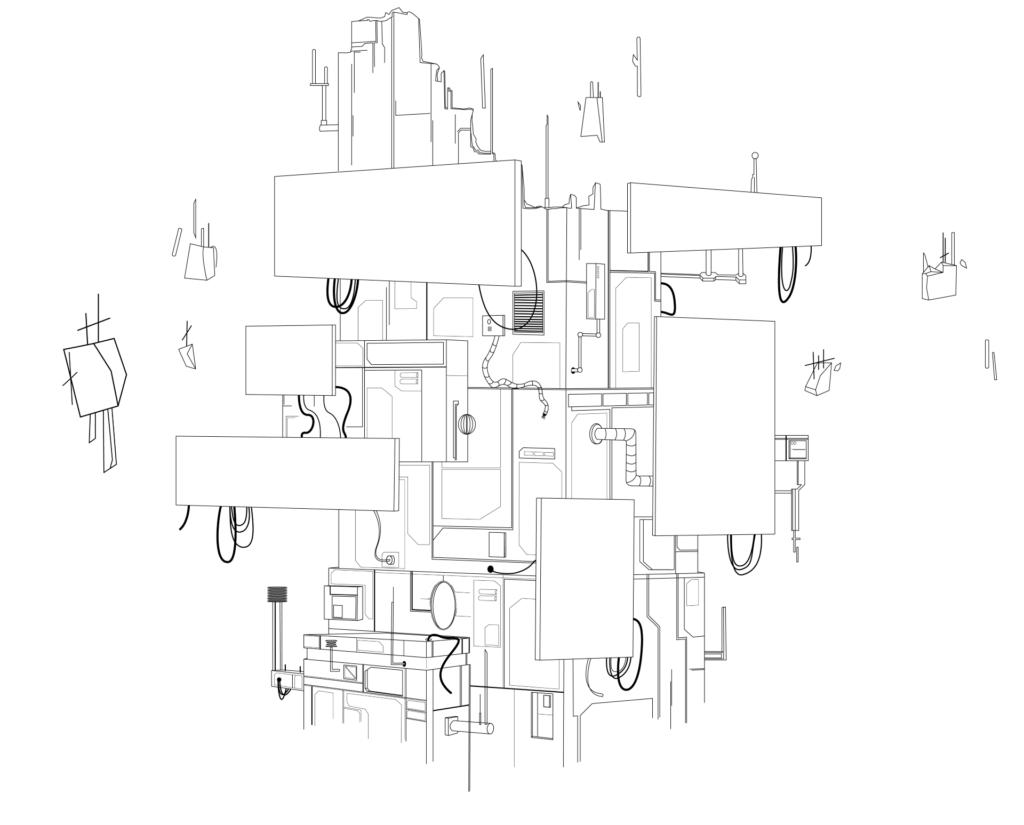
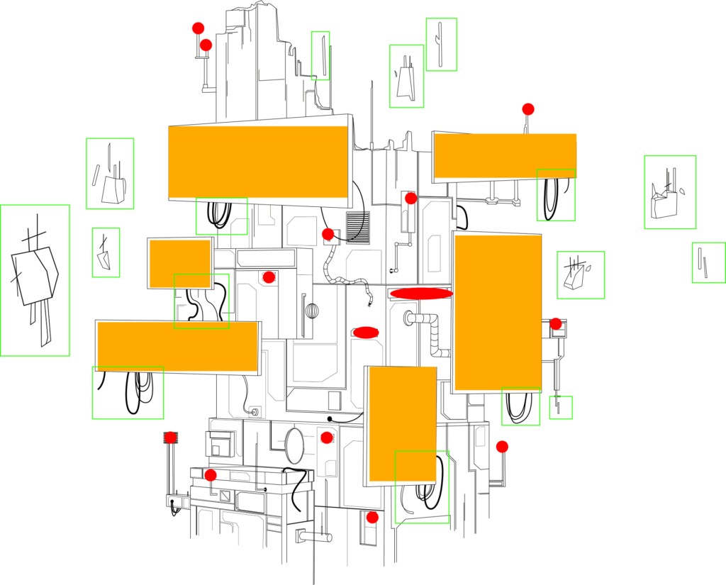
I created the main linework and vector elements in Adobe Illustrator, while also mapping out the animations such as screen positions, lighting effects, and moving parts.
After finishing the linework, I moved into Rive, where I created the animated cloud elements and applied the color for both dark and light mode versions.
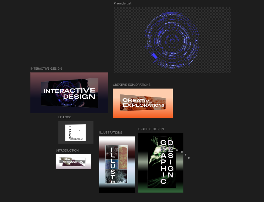
At this stage, I ran into the first technical challenge: the screen graphics were placed on different Rive artboards and needed to be displayed in perspective, but Rive doesn’t support artboard warping.
To solve this, I created the perspective graphics in Illustrator and Clip Studio Paint, where I had control over warping. I then imported the finished elements into Rive for animation.
An alternative pipeline would have been After Effects → Lottie → Rive, but for this project, staying in Rive for animation proved faster and more direct.
Each screen displays a section name of my portfolio along with a relevant visual as the background which gives context at a glance.
Next step was animating the screen animations, floating debris and the clouds.
Then I created the Rive state machine, so that when hovering over the screens there is an outline, the moon/sun gets bigger and switches between dark and light modes.
I also realized that the moon/sun crops out when viewing on mobile, so I moved it a bit towards the center.
I imported the final animation into the website using JavaScript, HTML, and CSS, along with some help from AI-powered development tools.
The setup was designed to be responsive — the interface crops horizontally as the browser window narrows, and once it reaches a defined mobile breakpoint, it switches to scaling instead. This ensures that the interactive elements stay within view regardless of screen size.
One technical challenge emerged during this phase: the Rive web player does not support vector feathering, which I had used for soft edges. To resolve this, I went back and replaced those elements with transparent PNGs to maintain the visual style and re-animated them.
This is also where I really learned the importance of optimization. Although swapping vectors for images slightly increased file size, it significantly reduced the computational load, leading to much better performance — especially on mobile devices.
Final Outcome
Reflection
This project was an opportunity to combine creative direction, technical execution, and problem-solving into a single piece of design. From sketching initial concepts to resolving real-time web limitations. Every step made me to think across disciplines as I had to think about the design, user experince, animation and frontend implementation at all times during the process.
It not only expanded my toolkit, but also deepened my understanding of how aesthetic and functionality can work together, especially in interactive design environments such as web.
In the end, the project became a working piece of my portfolio, one that showcases both my style and the way I like to approach design: bold, purposeful, and unique.